Poker variance simulator
(c) Jussi Palomäki, 2017-2023
library(tidyverse)
library(gganimate)
library(transformr)
library(plotly)

variance_simulator <- function(hands, winrate, SD, players, topbottom=F) {

  simulations = data.frame(nrow = 0)
  cumEV = cumsum(rep(winrate, hands))
  cumSD = sqrt(cumsum(rep(SD^2, hands))) #first convert to variance, then convert the sum back to SD
  lower <- qnorm(0.025, cumEV, cumSD)
  upper <- qnorm(0.975, cumEV, cumSD)
  confidence <- data.frame(cbind(lower, upper))
  confidence$ID <- seq.int(nrow(confidence))

  for (i in 1:players) {
    test <- rnorm(hands, mean=winrate, sd=SD)
    test <- data.frame(run = test)
    #names(test)[1] <- paste("Player ",i,sep="")
    names(test)[1] <- i
    simulations <- cbind(simulations, cumsum(test))
    simulations$nrow <- NULL
  }


  max_value <- which(tail(simulations, 1) == max(tail(simulations, 1))) #Among the last row, which column has the highest value
  min_value <- which(tail(simulations, 1) == min(tail(simulations, 1))) #Among the last row, which column has the lowest value

  simulations$ID <- seq.int(nrow(simulations))

  simulations.long <- simulations %>%
    gather(key, value, -ID) %>%
    dplyr::mutate(profit = factor(ifelse(value > cumEV, 1, 0)))

  #Plot all "players"
  plot <- simulations.long %>%
    ggplot(aes(ID, value, group=key)) + #group here required for complex animation
    geom_line(aes(colour = key)) +
    geom_line(data = confidence, aes(x = ID, y = lower), linetype="dashed", color="black", size=0.5, inherit.aes=F) +
    geom_line(data = confidence, aes(x = ID, y = upper), linetype="dashed", color="black", size=0.5, inherit.aes=F) +
    geom_abline(intercept = 0, slope = winrate, linetype="dashed", size=1) +
    xlab("Hands played") + ylab("Big blinds won") +
    scale_x_continuous(labels=function(x)x*100) +
    theme_bw(base_size=14) +
    guides(color="none")


  #Plot only the top and bottom "players"
  plot2 <- simulations.long %>%
    dplyr::filter(key == max_value | key == min_value) %>%
    dplyr::mutate(key = factor(key, levels = c(max_value, min_value),
                               labels = c("Best\nluck", "Worst\nluck"))) %>%
    ggplot(aes(ID, value, group=key)) +
    geom_line(aes(colour = key)) +
    geom_line(data = confidence, aes(x = ID, y = lower), linetype="dashed", color="black", size=0.5, inherit.aes=F) +
    geom_line(data = confidence, aes(x = ID, y = upper), linetype="dashed", color="black", size=0.5, inherit.aes=F) +
    geom_abline(intercept = 0, slope = winrate, linetype="dashed", size=1) +
    xlab("Hands played") + ylab("Big blinds won") +
    scale_x_continuous(labels=function(x)x*100) +
    theme_bw(base_size=14) +
    guides(color="none")


  if (topbottom == F) {
    return(plot)
    }
  else {
    return(plot2)
    }
}

#variance_simulator(500, 1.5, 75, 30)
This simulator illustrates the interplay of skill and chance in poker. The hypothetical players’ levels of skill are defined as their winrate, which is the average amount of profit (or loss) over 100 poker hands played and represented by the dashed straight line. The standard deviation (SD) of every player’s winrate is set as 75, which is normal in No Limit Hold’em poker (but is higher in other formats like Pot Limit Omaha). The dashed curved lines represent the 2.5% and 97.5% percentiles (the 95% confidence interval) of the cumulative expected winnings at any given point in time. The players have positive but low winrates (1.5 big blinds per 100 hands), and the simulations runs through 50,000 hands (i.e. 50,000 rounds of play in poker). For clarity, only the top and bottom earning players are visualized. Since both players have identical skill, their difference in big blinds won must be attributed to variance alone, or, in layman’s terms, luck. Thus, the difference between the two curves is a direct illustration of the role of luck in the game, given a relatively low sample of 50,000 hands, and the relatively low winrate of 1.5 big blinds per 100 hands of play.
TL;DR: 30 poker players with the same amount of skill play poker for 50,000 hands. The winnings/losings for the one with the best luck and the one with the worst luck are visualized.
animation <- variance_simulator(500, 1.5, 75, 30, topbottom=T) +
  geom_segment(aes(xend = 520, yend = value), linetype = 2, colour = 'grey') +
  geom_point(size=2) +
  geom_text(aes(x = 500, label = key, color=profit), hjust = 0) +
  #geom_text(aes(x = 500, label = round(value, -2), color=profit), vjust = -0.30, hjust = 0) +
  scale_color_manual(values=c("red", "darkgreen", "lightblue", "salmon")) +
  transition_reveal(ID) +
  coord_cartesian(clip = 'off')

animate(animation, duration = 25, fps = 10)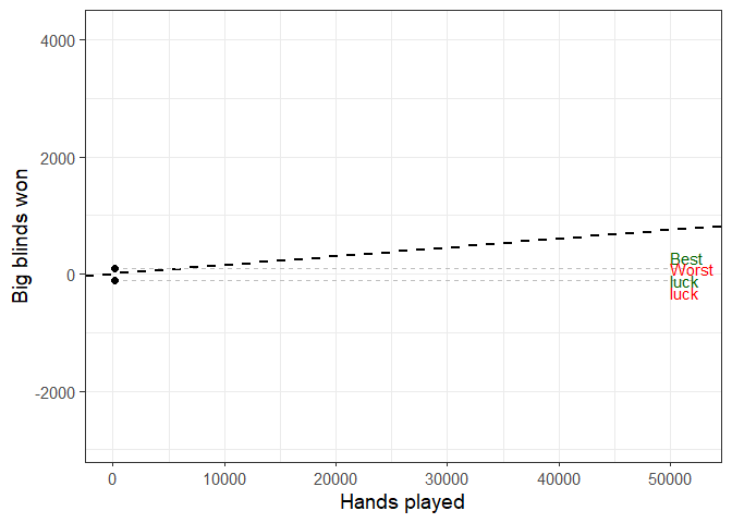
Below, I’ve rerun the simulation (hands = 50k, winrate = 1.5, SD of winrate = 75, players = 30) without animation, and visualized the entire spread of the observations.
variance_simulator(500, 1.5, 75, 30)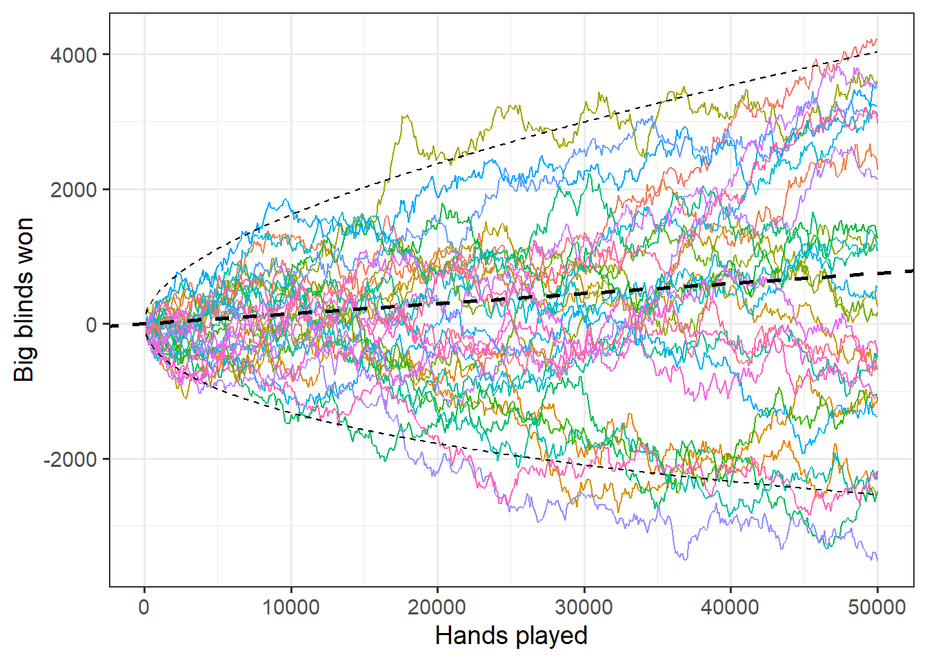
Credit: https://github.com/thomasp85/gganimate/wiki/Temperature-time-series